If you find these tutorials useful and would like to link to them from your own pages,please contact the Drew Spatial Data Center Director, Dr. Catherine Riihimaki via email. You are invited to leave comments or ask questions in any of the Comment areas of each tutorial page.
This tutorial was expanded and adapted from Kerski, J.J.. (2009). Exploring Data Using Cartograms within ArcGIS Desktop. Redlands, CA: ESRI. Retrieved October 5, 2009, from ESRI GIS Education Community: http://blogs.esri.com/Info/blogs/gisedcom/archive/2009/10/16/exploring-data-using-cartograms-within-arcgis-desktop.aspx.
What is a Cartogram?
Cartograms are a method of displaying geospatial data as totals, wherein data are displayed with both color and area as a function of their values. Cartograms are analogous to pie charts in which the slices of the pie are geographic regions rather than wedges. The Cartograms tool is a script created for ArcGIS that provides a set of spatial analysis tools not included in the standard ArcGIS software. You can create maps that will provoke reactions and dialog by displaying data as Cartograms. This tutorial will allow users to make Cartograms using their own data.
Download Cartograms Tutorial Files
Download the zipped tutorial files at: CartogramsTutorial.zip Be aware that the zipped package is approximately 5MB, so please allow sufficient time and memory space on your computer for download.
- A dialog box will appear titled, "Opening CartogramsTutorial.zip." Save the file to your computer's Desktop.
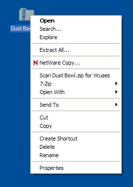
- Navigate to the desktop of your computer and unzip the file. To do this, right click on the CartogramsTutorial.zip folder. (click image to enlarge)
- Choose Extract All. The Windows Extraction Wizard will appear.
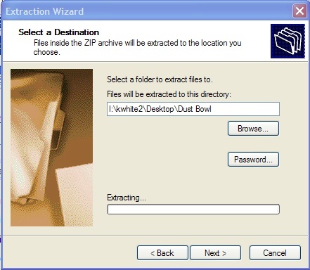
- Click Next. Make sure that the field under "Files will be extracted to this directory" points to your computer's desktop. (click image to enlarge)
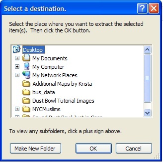
- If it does not point to your computer's Desktop, click the Browse button. The select a destination dialog box will appear.
- Choose the Desktop option that appears at the very top of the window in the dialog box. You may need to use the scroll bar on the right hand side of the window to see the Desktop Option. (click image to enlarge)
- Click OK.
- Once this field points to your computer's Desktop, click Next. Windows will unzip the file and tell you that the extraction is complete.
- Click the Finish button.
Install the Cartograms Tool
If you are working on a laptop or a computer in your office, you will need to download and install the ArcScript cartogram tool created by Tom Gross in the ESRI Applications Prototype Lab before beginning this tutorial. Download the files at
http://arcscripts.esri.com/details.asp?dbid=15638
and follow the installation instructions in the ReadMe file. Once you’ve installed the software, restart your computer.
Open the USPop2007 Map Project
- Open ArcMap.
- Click the An existing map; button.
- In the Browse area, highlight Browse for maps…
- Click OK. The Open dialog box should appear.
- In the Look In: pull down menu, choose Desktop.
- Highlight the CartogramsTutorial folder. Click OK.
- Highlight the USPop2007.mxd map project. Click OK.
Repair the Data Sources for your Map Layers
ArcMap sets file paths to find the data for each of your map layers. Because you moved the data files from this site to your Desktop, the file paths that ArcMap stored are no longer accurate. You can easily repair the file paths. This is something you will need to do each time you want to use a Map Project you’ve copied or moved from one location to another.
Repair Data Source
- Right click on the 2007 Population by County map layer. In the pop-up menu, choose Data → Repair Data Source. The Data Source dialog box will appear.
- In the Look In: menu of the Data Source dialog box, navigate to the CartogramsTutorial folder on the Desktop. If you do not see a path to the Desktop, you can find it in I:\YourUserName\Desktop.
- Double click on the CartogramsTutData.mdb personal geodatabase.
- Highlight the Counties file and click Add. The Counties file was renamed to 2007 Population by County in the ArcMap Table of Contents for the Map Project, but retains its original name in the Personal Geodatabase.
The Data Frame should now contain a map of the continental United States, with the 2007 Population by County indicated in an orange color scheme.
Add the Cartograms Tool to ArcToolbox
- Open ArcToolbox by clicking on the ArcToolbox button.
- Right click on the white space inside the ArcToolbox menu. Choose New Toolbox. A new, unnamed toolbox will appear in the Toolbox menu. Name it Cartograms.
ArcToolbox Cartograms Menu - Right click on the title of the new Cartogram toolbox. Choose Add → Tool.
- Check the box next to the Cartograms option. Click OK.
The Cartogram → Create a cartogram (Gastner-Newman method) tool will appear.
Use the Cartograms Tool
- Open the Cartograms Tool and double click on Create a cartogram. The Create a cartogram dialog box will appear.
- Fill in the values for these fields:
- Original Polygon Features – Choose 2007 Population by County
- Value Field of the Original Features – Choose POP07_SQMI
- Allow the default Output Cartograms Features
- Uncheck the box next to Sum the Values for each repeated ID
- Scroll down and make sure that the box is checked next to Copy the Original Polygon Features table to the Output Cartogram Features table.
Your dialog box should look like this:
Create Cartogram Dialog Box
3. Click OK.
A Cartogram will be created in the new layer. Cartograms distort map shapes to emphasize specified values from underlying map data. In this case, shape of the U.S. map will be distorted to reflect the population density of each area, since you chose to use the POP07_SQMI value from the attributes of the 2007 Population by Counties Map Layer as your Value Field for analysis. Areas with greater population densities will be larger than those with smaller population densities. This new layer will not be Symbolized – meaning that the color scheme indicating population density has not been transferred from the 2007 Population by County Map Layer.
Symbolize the Counties_Cartogram Layer
- Right click on the Counties_Cartogram Map Layer. Choose Properties. The Layer Properties dialog box will appear.
- Click the General Tab. In the Layer name field, type 2007 Population Density Cartogram. This will rename the Counties_Cartogram Map Layer. Click Apply.
- Click the Symbology tab. In the Show: menu, choose Quantities → Graduated colors. Use the default color ramp.
- In the Fields area under Value:, choose POP07_SQMI.
- Under Classification, click on the Classify button. The Classification dialog box will appear.
- At the top, left hand side of the Classification dialog box, under Classification, change the number of Classes from 5 to 4. Click OK.
- Back in the Layer Properties →Symbology area, under Color Ramp, click on the Label title and choose Format Labels.
Symbolize Quantities Value Pulldown Menu and Color Ramp - In the Number Format dialog box under Rounding, change the Number of decimal places to 0. Click Apply.
- Click on the Labels tab.
- Check the box next to Label features in this layer.
- Under Text String in the Label Field, choose the value STATE_NAME from the pull down men.
- Click OK.
- Turn off the 2007 Population by County layer by un-checking the box next to its title in the Table of Contents.
The graphic clearly emphasizes the areas of greatest population density in the continental U.S., with the Mid-Atlantic region being the most densely populated.
Cartogram Output Map


